Thursday, March 19, 2015

90's X-Men Animated


Sorry everyone, I don't post as often here on blogspot just because it's so time consuming and not at easy as facebook. If you're interested in following me and seeing less sporadic updates please follow me at the following sites:
www.facebook.com/pinkhavok
http://pinkhavok.tumblr.com/
https://instagram.com/pinkhavok/

It’s FINALLY heeeeeere!!!!
Yes I know I’m a bit excited but I’ve been working on this piece on and off for months and I am sooooooo glad that it’s finally over (though it was a lot of fun)!
This piece is my homage to the 90’s Animated X-Men cartoon, one of my favorite 90’s cartoons and easily one of the most influential towards me as an artist. I absolutely love that it was heavily influenced by Jim Lee’s designs, something that was so important to me as a kid since I was getting into comics during his legendary run on the comic book series. He’s always been one of my artistic idols and it’s great to have the chance to put my own spin on his work.
I will say that this piece was a lot of fun for me when it comes to my “comic book” style and I think I grew a lot through it. I’m continually trying to refine what I feel my comic book style is. I’m really striving to showcase a painted style that reflects some of my biggest comic book influences (like J. Scott Campbell, Jim Lee, and Marko Djurdjevic) while at the same time bringing an exaggerated style from animated designers that I love (Phil Bourassa influences me so much nowadays, probably more than anyone realizes).
For those of you that are still here and interested, artistically this was a real challenge for me. With my previous Batman Animated Collage piece I had worked with roughly 22 characters but with this one I decided to push even higher by roughly 10 more characters. That definitely presented a lot of challenges when it came to composition and layout. However, more than anything, the real challenge was the patience to keep going and paint so many characters in one piece. Luckily I made it through and while no painting ever truly gets to the level of epicness that I’m striving for, at least for where I’m at right now, at this point and time in my artistic growth, I can say that it was the best that my skills would allow me to accomplish.
Anyways, I’ve been sitting on this for a while and thought it’s best now to put it out there for all of you to see. I was hoping that I could unveil it at Emerald City Comic Con 2015 but it was too much of a rush and I didn’t want to sacrifice quality. So long and short of it, this piece will be making it’s debut at MegaCon 2015!
In closing, I hope this piece brought back some warm and fuzzy nostalgic feelings for you and you remember the 90’s with fondness; it’s one of my favorite decades! Thank you for all your support and if you feel so inclined please like this and feel free to share it with your friends!

Sunday, June 1, 2014

Leonardo

Well here's the first in my new set of Ninja Turtles Paintings: Leonardo!

Leonardo and all his brothers will be making their debut this Thursday at the Phoenix Comic Con! So in honor of that I will be releasing one painting each day until then!

If you've kept up with me then you know that I really wanted to try and change up the look of the turtles. However, I decided not to push them as much as I would have liked since I think it would have alienated a lot of fans and been unwise financially. However, I did try and change up some things from when I first tackled them a couple of years ago so I hope you like them!

For now, enjoy Leonardo and get ready for tomorrow night when I unveil the next turtle! Until then...TURTLE POWER!!!

#turtlepower
#eastmanandlarid
#tmnt
#teenagemutantninjaturtles
#ninjaturtles
#fanart
#leonardo
#phoenixcomiccon
#denvercomiccon
#pinkhavok
#blakehenriksen
#blakehenriksenart

Monday, May 19, 2014

Gotham City Mugshots: Two-Face

Here's my latest Gotham City Mugshot: Two-Face!

It's been a long time coming and hopefully I'll be able to do more of the series without such a long break in between like with the Joker. For now though, enjoy my homage to Batman The Animated Series' Two-Face with my personal take on him!

#batman
#batmanandrobin
#batmantheanimatedseries
#btas
#twoface
#harveydent
#brucetimm
#dccomics
#comicart
#fanart
#pinkhavok
#blakehenriksen
#blakehenriksenart
#art


Saturday, May 3, 2014

Slave Harley and Joker the Hutt

Happy Star Wars Day!!! I know it's kind of early (unless you're on the East Coast) but I thought this new piece would be a great way to kick off the celebration on my end!

This is a mash up piece, one of many I plan to do as time goes on. In case you can't tell it's Harley Quinn from Batman with Jabba the Hutt from Star Wars. However, since this is a mash up, these are not the characters and worlds we are familiar with. Suffice it to say this is Slave Harley, who happens to be owned by Joker The Hutt. Though as you can see, Harley's not much of a slave since she enjoys the smiling Hutt. He's her "Puddin" after all :)

I'm sure that there are all sorts of stories to be had on what this world entails and I'm not going to really come up with much so I'll let your imagination loose as you wonder just who else is in this new universe and how they all fit together! So for now, May the 4th be with you!

P.S. This print will be available for purchase at The Phoenix Comic Con next month! Stay tuned for details.

#harleyquinn
#harley
#joker
#jabbathehutt
#jokerthehutt
#slaveleia
#slaveharley
#slaveharleyquinn
#starwars
#pinkhavok
#blakehenriksen
#blakehenriksenart
#phoenixcomiccon
#comiccon
#fanart
#starwarsfanart

Monday, April 7, 2014

Art Drop!!!

Hey everyone! It's been a while since I've updated here (I usually do it more often at my Facebook fanpage: http://www.facebook.com/pinkhavok)

First up is Green Ranger, followed up by a new piece Angela (from Guardians of the Galaxy) that I created in conjunction with my buddy Jon Hughes. He did the line art and I did the painting. Next is a piece I did close to a year ago for Fantasy Flight Games and their Star Wars the Card Game. Then there is an alternate cover I did for my friend Shelby Robertson and his comic book "94". Finally a Doctor Who piece I recently did. I hope you enjoy it :)


Monday, December 30, 2013

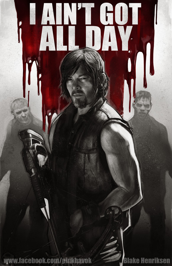
Daryl Dixon Animated .GIF

Here's a LINK to an animated .GIF I created showing my process for creating my recent Daryl Dixon painting from my Walking Dead Series (which you see here)

. You'll notice that I messed up and had to start over. Such is life lol! But I think that it's good for everyone to see the process, especially beginners because it's good to know that everyone still messes up from time to time. Just part of the Journey:)

P.S. If you're interested in buying this print please check out my Etsy Store LINK

Friday, December 27, 2013

Etsy Store Up and Running!!!

Hey everyone I have an Etsy store up! This is a great way to purchase some of my prints if you don't get a chance to see me at a comic convention! Here's the link:

http://www.etsy.com/shop/PinkHavok

Thursday, December 26, 2013

Gotham City Mugshots: Joker

Merry Christmas everyone Joker style!!!

We’ll I’m not the first to have ever done this type of thing but here’s the first in a long line of paintings in a series I’m calling “Gotham City Mugshots”. The name’s pretty explanatory so I think you can imagine who all will be in this series. For now, here’s this first post giving all of you some Christmas love for supporting me and my art! Thanks and Merry Christmas!!!

-Blake

Walking Dead Prints

Hey everyone! Haven't been posting as much here (I usually save that for my facebook fanpage: www.facebook.com/pinkhavok and my tumblr: www.pinkhavok.tumblr.com). Anyways, here are my final Walking Dead prints next to each other! as a set! Enjoy!

Thursday, September 12, 2013

Where's Carl?


Hey everyone! Here's my new poster of Carl from "The Walking Dead". A big thanks to everyone that commented and gave their opinion as to which way I should go. Ultimately I went with number 19 as that's the one I was leaning towards and it seemed the one that the most people agreed on.

As I said before this is the first in a series of Walking Dead pieces that I'll be doing. As many of you know this is a departure from my usual "style" which is more comic book oriented. I really love the comic style but I also enjoy trying to push myself and do more realistic pieces as well. This is something that anyone can tell if you've seen my photostudies that I post on here from time to time.

If you're curious as to why I came up with the idea, I was greatly influenced by Marko Djurdjevic's work on the Magneto series around 6-7 years ago. He's one of my biggest influences and I really enjoyed his use of just black and white covers with the occasional splash of red.

With this piece in particular I knew that I wanted to do something with The Walking Dead but I didn't want it to look totally photo real. I wanted it to have a painterly aspect to it and also a little bit of a Drew Struzan influence as well. I also thought that the red and the black and white would give it a certain "graphic art" feel to it and would be something different than my normal work. In the end, it doesn't play as much into the graphic design elements that I originally thought it would but that's OK. It's not my area of strength and I still feel I achieved the overall feel that I was going for.

Also I can't help but bring up the fact that I find this extremely funny because in a post apocalyptic world the young kid Carl is always this close to getting killed lol! It's well known that they always ask "Where's Carl?" but I had to do it

As a final note, doing a piece like this is one of the many benefits that I have working on a freelance basis. I am not "shackled" to a style that my boss expects of me. I can experiment and I can delve into new "places" I couldn't have necessarily explored before. A big thank you goes out to my wife for believing in me and supporting me nearly two years ago to leave a studio and strike out on my own. It was the best career move I ever made and it wouldn't be possible without her support. Thanks babe I love you!

-Blake

P.S. I'll have progress shots up with some descriptions
in the next bit.

Friday, May 24, 2013

Steel Dragons

Steampunk in Feudal Japan?! Doesn't that sound cool?! If it does than here's a little taste of my recent art for "Steel Dragons"! AND PLEASE SHARE!

"Steel Dragons" is a Digital Tabletop Game which is currently in production by Quick Charge Games. They are a great bunch of guys and a real dream to work with! Here is just a taste of the work that we've been doing.

If you're interested in the game check out their website at the link I've provided: http://www.steel-dragons.com/news/steampunk-feudal-japan-steel-dragons/

There's a lot of things that will be happening so feel free to sign up for the mailing list! There will be a Kickstarter campaign in the near future as well so the mailing list is an excellent way to keep informed! Also, I'll be posting here as well as information is made available.

Finally, don't forget to come by and see me at the Denver Comic Con. It's May 31st to June 2nd at the Denver Convention Center! I'll be in Artist Valley at table H18 talking about "Steel Dragons" and showcasing some of my concept work for the game as well as selling prints, talking to everyone and just having fun! Feel free to stop by and say hi! Thanks!

-Blake

It's update time!

Well it's been a while so it's time for me to update! It just seems like Facebook is so much easier that unfortunately I just don't do this as often :(

Anyways, first up are some more Photostudies, this time of Hit Girl and RoboCop. After that comes some old paintings I did for the Lord of the Rings Card Game by Fantasy Flight Games. Finally you can see some of the printed cards that I recieved!


Tuesday, April 9, 2013

Darth Vader Photostudy

Here's another Photostudy from "The Empire Strikes Back". This time of Darth Vader.

Amazingly, this is actually the first time I ever painted Darth Vader and man did that helmet give me some trouble! However, it was a good challenge and I learned a lot from it!

This did take longer than I wanted just shy of 3 hours. Between the helmet and the lightsaber's fx and perspective I got a little side tracked. No matter though, tons of fun as always in Photoshop :) Enjoy!

Monday, April 8, 2013

Luke Skywalker -"The Empire Strikes Back" Photostudy

Here's another Photostudy, this time from my most favorite of the Star Wars movies "The Empire Strikes Back".

This did take a little longer than I wanted, about 2hrs and 20 mins. However, I'm really trying to learn how to nail faces and this was just one of those times that it was a little more difficult. Luke has such a recognizable face and I think sometimes just knowing that there is a self imposed time limit means that it can be a little more difficult to capture the essence of the character.

Either way this was a lot of fun and as always great practice. It's interesting too because I changing up my approach a little working more with soft brushes to have smoother blending and gradients. Not sure if I'll stick with it forever (since I do love texture brushes) but it's great fun to experiment. Also, I have to say I really love the high contrast of the movie still that I was studying from. I love cinematic lighting!

Sunday, April 7, 2013

Captain Picard Photostudy

Another photostudy, this time from one of my all time favorite movies "Star Trek: First Contact". This is from the Halodeck scene when Capt. Picard is shooting up some borg intruders. If you haven't seen this movie you need to! I think it still holds up even if it is 17 years old!

I know everyone has their favorite captain and while some might disagree, Captain Picard is still my favorite captain, though that could be because I grew up with him :)

Anyways, as far as the art part goes this took 2 hours in Photoshop CS4. I wanted to play around with trying to get a likeness so I spent some more time on it, and all in all I think I got pretty close. It's not 100% but I think it comes close enough that most will realize who it is. Either way, practice, practice, practice! I'm trying to speed up how quickly I can nail a likeness, I don't want to spend 10 hrs trying to get it!

Well enjoy the rest of your Sunday and God bless!

"The Dark Knight" and "The Caped Crusader and Boy Wonder" Photostudies


"The Dark Knight" - Another quick and dirty  study. This one was about 50 minutes, trying to push it so I could get it done even quicker. Hard as always to get the likeness in such a short time but workin on it. Practice, practice, practice!
"The Caped Crusader and Boy Wonder" - Another "Dark Knight" study lol :) Well not really the Dark Knight were used to seeing, but the classic Caped Crusader and Boy Wonder of the 1960's!

I had fun with this one because of the campy nature of it, as well as all of the different colors in the palette. Also, this was a chance for me to really play around with texture brushes. I'm a big fan of very painterly, impressionistic work so this was a time for me to try and capture the mood without getting too caught up in details.

It's also a good exercise because I want to see how "painterly" I can be and still sell the idea without having to focus so much on the detail. Since it's personal work I can experiment and not be bogged down by what an art director thinks my style is supposed to look like. There's a lot of freedom in doing exercises like this :)

Finally, if you're curious, this was done in Photoshop CS4 and took 1hr and 30 mins. Thanks and enjoy your Sunday!

Monday, April 1, 2013

New Art!

Scorpion Redesigns: Here are my turnarounds for my Scorpion Redesigns. My goal was to redesign Scorpion (from Mortal Kombat) for a High Fantasy genre such as Lord of the Rings.

This was a great exercise for me because in my professional work I never really do turnarounds. More often than not it's just characters in static poses in order to convey the idea. It really forced me to think in 3 dimensions.

If there are any 3D modellers out here who would like to model this, please feel free to have a go at it. Just let me know as I'd love to see the final product! Thanks!


 Photo Studies: Got inspired to learn and practice from "The Dark Knight". Commissioner Gordon's likeness got away from me but I feel like I got Joker's. Gordon took 1hr and 25mins and Joker took 1hr and 15mins.

Sunday, March 17, 2013

How to paint a Black Alpha poster in 10 easy Steps!

Well maybe these steps weren't so easy lol :) Anyways, here it is. As you can tell it changed throughout the painting process, especially with a little tweaking in the composition in the end. I had originally thought that I would add all of this typography to make it look like a real movie poster but sadly it's just not my strength. I just could never get the type to look cohesive so I decided to drop it and not focus on it. Anyways, enjoy!

-Blake

Black Alpha is a trademark and copyright of Tom Rasch

Black Alpha Poster

Here’s a little fan art love for “Black Alpha”!

If you don’t know who or what Black Alpha is then let me enlighten you! Black Alpha is the brainchild and upcoming comic book series from my buddy Tom Rasch. Without going too in-depth, basically think of it as an intergalactic space adventure that brings together story elements similar to Batman, a little bit of Iron Man tech and takes place in an expansive universe similar to Star Wars.

Every since I met Tom and saw his passion for this story I knew that it would be a success. The first thing I thought when I looked at the character designs was “This is gonna be on Cartoon Network’s Saturday night line-up”. Anyway, I fell in love with it and could see how this world would one day branch out from comics to all forms of entertainment and it’s starting to happen! Needless to say, if you haven’t checked out Black Alpha, you need to right now! Here’s the link to the Black Alpha fan page on Facebook: https://www.facebook.com/blackalpha3

Please like and share with you’re friends too!

As far as this picture goes, I’ve been working on and off on this for about a month. I knew for the past year or so that I wanted to do some fan art for Black Alpha, but as is so often the case it was easy to get caught up with other things. Finally, I decided that I really wanted to tackle it.

I knew that I wanted to do something different with it and my first thought was something that was like a Star Wars poster. I’ve always loved Drew Struzan’s work; especially for the Star Wars posters (he’s easily one of the greatest illustrators of all time in my opinion) so I decided to channel that type of feel into this painting. It was a real struggle, trying to figure out how many figures to put in. Initially, I had thought of doing a lot more but I felt it might get a little too cluttered, so I decided to streamline it a little.

Another struggle was to try and give a digital painting a feel that was similar to Struzan’s traditional work. It was a struggle but I learned a lot and had fun, since I do love texture! Anyways, you never get as close as you want but for where I’m at right now it’s as close as I can come.

In the end I tried to take a little artistic liberty with the color schemes and some of the designs to try and make it feel cohesive in the painting. It’s really just my interpretation of the Black Alpha universe, so there are some slight variations from the comic designs.

One last thing I thought I’d mention is that in order to try and emulate Struzan’s work, I decided to keep to a minimal color palette. Since most of his work has a very warm color scheme I decided to stick with that, hopefully giving the impression of working off of a burnt sienna paper.

Well if you made it this far congrats! Oh and if you’re curious, as always, this was painted in Photoshop CS4! Have a great day and don’t forget to check out Black Alpha!

-Blake

Black Alpha is a trademark and copyright of Tom Rasch